
3 Underrated Visualization Techniques Every Data Scientist Should Know
Elevate your analysis

Breaking old habits is hard!
And not looking beyond what we know can sometimes cause us to stagnate in our careers.
This got me thinking about how often we, as data scientists, default to the same basic visualizations without considering other techniques that could give us more insights, faster.
Over the years, I’ve come across a handful of underrated visualization techniques that have completely transformed how I approach exploratory data analysis.
So today, I want to share three of my favorite techniques, simple to use but incredibly powerful.
By the end of this article, you’ll know exactly when and why to use them to take your analysis to the next level.
…and you can finally stop using bar plots for everything 😉
1. ECDF (Empirical Cumulative Distribution Function)
An underrated way to quickly compare distributions without losing details.
Most people default to histograms for analyzing distributions, but these can blur patterns or exaggerate differences due to arbitrary bin sizes. ECDFs on the other hand, show the full distribution, of every data point, in a clear, cumulative view.
This is one of my go-to’s when doing EDA, since it makes it easier to compare datasets, spot outliers, and uncover subtle trends.
What would it look like in practice?
Let’s say you’re working on a product team and want to compare session durations between free and premium users. ECDFs help you see, at a glance, which group tends to stay longer and where the differences are most noticeable.
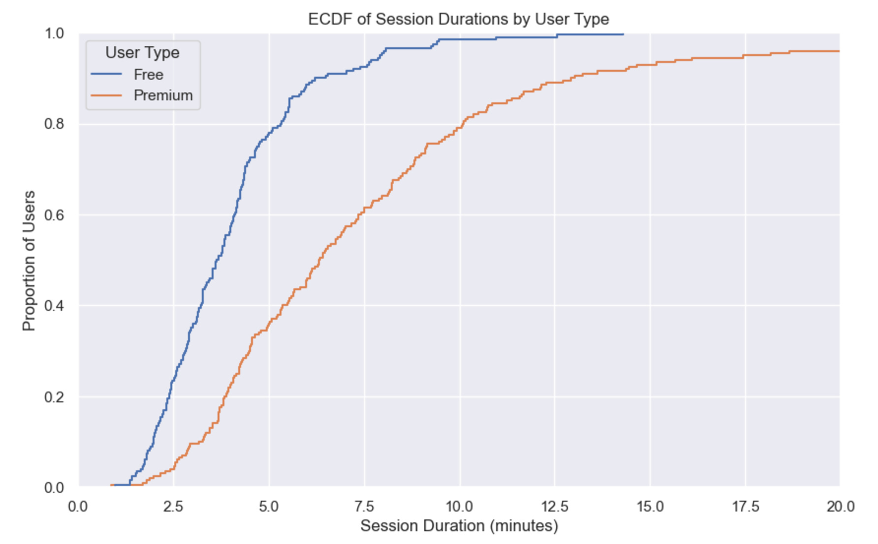
As we can see from the graph, Premium users tend to have longer sessions overall, with about 50% staying for 5 minutes or more. On the other hand, Free users often end their sessions earlier, though around 70% still reach the 5-minute mark.
👇
2. Pairplot
A shortcut for uncovering relationships between features, fast.
Pairplots are one of those tools most people know about, but they tend to overlook and go straight into correlation heat maps and scatter plots. But here’s the thing: they’re unbeatable when you need a quick and clear look at how multiple features relate to each other—and they even let you add category-level insights.
What would it look like in practice?
Imagine you’re analyzing data for a marketplace platform. You want to understand how product price, shipping cost, and reviews interact, especially for different seller types. A single pairplot gives you all the context you need to start identifying trends and outliers, saving you time for deeper analysis.
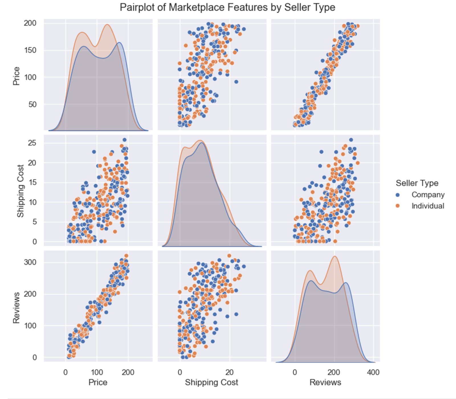
A few insights we can quickly extract are: Price and Shipping Cost are strongly correlated, especially for Individual sellers. Company sellers tend to have higher prices and shipping costs, while Individual sellers are more evenly distributed across all ranges.
Here’s what plotting (using Seaborn) would look like for this example:
3. FacetGrids
Your go-to for visualizing multidimensional data effortlessly.
FacetGrids are criminally underused. Sure, they take a little more effort to set up, but the payoff is huge: they let you split your data into smaller, more digestible pieces so you can compare trends across multiple dimensions at once.
What would it look like in practice?
Let’s say you’re on a growth team analyzing the age distribution of users across acquisition channels (Organic vs. Paid) and device types (Mobile vs. Desktop). This FacetGrid shows how user demographics vary, helping you tailor campaigns and features to different audience segments.
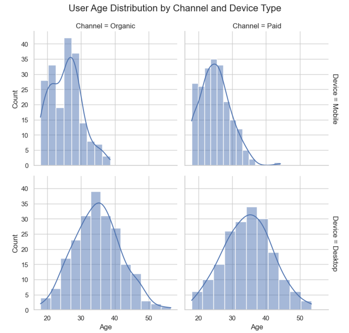
With this FacetGrid we can quickly observe that Mobile users are younger, peaking at around 25, while Desktop users are older, peaking at around 35. This trend holds across both Organic and Paid channels, reflecting app vs. web audience differences.
Here’s what plotting (using Seaborn) would look like for this example:
Thank you for reading! I hope these visualization techniques help you take your analysis to the next level.
See you next week!
- Andres
Before you go, please hit the like ❤️ button at the bottom of this email to help support me. It truly makes a difference!
nice.)
I love facetgrids and may have over-used it to impress people